
The Missing Semester: Proteomics
Differential protein analysis and biomarker identification.

Welcome to Lesson 3 in Module 1: Data types, of Bioinformatics: The Missing Semester!
Throughout this series, we’ve been talking about data derived from cellular gene expression; both RNA and spatial transcriptomics readouts.
However, in this write-up, we’ll explore a totally new modality: proteins.
Introduction
Shifting from RNA to protein requires a bit of intentional mental reframing. To date, we’ve covered how gene expression can help us identify single-cell populations and how adding spatial coordinates can help map distinct biological niches at near single-cell resolution.
So, let’s use that information to expand on our thinking and consider the functional implications of gene expression, through proteomics.
Mass Spectrometry (MS) is a critical application which enables the large-scale study of proteins. Typically, analysis of cellular proteins can support differential expression analysis, post-translational modification analysis, protein quantification and perhaps most relevant to a commercial setting: biomarker identification.
In this walkthrough, we’ll cover a differential analysis of protein data generated by MS, walking through fundamental methods used by scientists and engineers in commercial R&D.
Let’s get started.
Data pre-processing and formatting
Unlike the previous two lessons on scRNA transcriptomics and spatial transcriptomics which made use of toy datasets, canned mass spec data is harder to come by (which was not fun for me having to track usable data down, but data accessibility is a different conversation).
For that reason, we’ll be working with real-world quantitative data from the UCSD Center for Computational Mass Spectrometry. If you’re interested in the biology, the data was derived from a 2024 study that found ATF6 promotes colorectal cancer growth and stemness through Wnt regulation.
As always, we begin by importing dependencies and loading the data:
import matplotlib.pyplot as plt
import numpy as np
import pandas as pd
from scipy.stats import ttest_ind
from statsmodels.stats.multitest import multipletests


file_path = "/Users/aneesavalentine/Downloads/msstats_quant_results.txt"

df = pd.read_csv(file_path, sep='\t')
We must reshape the data to a wide format, such that we create a matrix of dimensions: protein x sample, populated with intensity values:
protein_matrix = df.pivot_table(index='ProteinName', columns='BioReplicate', values='Intensity')There are quite a few parallels we can draw between protein abundance/intensity data and scRNA-seq data; one being, that they both require logarithmic transformation and normalization to address data skew and variance.
1. Log2 Transformation:
MS intensity values are highly right-skewed (i.e., long-tailed) often spanning multiple orders of magnitude. Transforming helps make the data more symmetric and stabilizes variance across intensity levels.
2. Normalization Across Samples
MS data often has sample-specific biases due to instrument drift, sample loading differences, etc. To minimize bias, the following normalization techniques can be utilized:
Median normalization (subtract sample-wise median from each value)
Quantile normalization (forces all samples to have the same distribution)
Variance Stabilizing Normalization (applies transformation and variance stabilization simultaneously
So let’s do a log2 transformation:
# exclude the 'BioReplicate' column from transformation
log_transformed = protein_matrix.applymap(lambda x: np.log2(x) if x > 0 else np.nan)
Followed by a median normalization:
normalized = log_transformed.subtract(log_transformed.median(axis=0), axis=1)Statistical testing
This is the fun part.
Do you remember structuring simple t-tests as part of your introductory statistics class? Personally, I vividly remember running ANOVAS in MatLab as an undergrad.
What we learned then will have practical application now.
Recall that a t-test is used to determine whether there is a statistically significant difference between the means of two groups. In the context of our workflow, it will help us ask:
“Is the difference in protein abundance between DMSO and ATF6 inhibitors likely due to real biological variation, or could it have happened by random chance?”
The test returns a p-value, which estimates the probability of observing the difference (or a more extreme one) assuming the null hypothesis is true (i.e., there is no real difference).
To answer this question, first we need to define our control and treatment groups:
control_cols = [col for col in normalized.columns if col.startswith("DMSO")]
treatment_cols = [col for col in normalized.columns if col.startswith("G0803") or col.startswith("G8255")]
Since we have two inhibitors, we’ll add them both to a single group, giving us: DMSO (control) vs ATF6 inhibitors (treatment).
# Initialize results list
results = []

# Iterate through each protein (row)
for protein in normalized.index:
    control_vals = normalized.loc[protein, control_cols].dropna()
    treat_vals = normalized.loc[protein, treatment_cols].dropna()

    # Perform t-test only if sufficient replicates are present
    if len(control_vals) > 1 and len(treat_vals) > 1:
        stat, pval = ttest_ind(treat_vals, control_vals, equal_var=False)
        log2fc = treat_vals.mean() - control_vals.mean()  # Assuming data is log2-transformed
        results.append({
            'Protein_ID': protein,
            'log2_FC': log2fc,
            'pval': pval
        })

# Convert to DataFrame
res_df = pd.DataFrame(results)
The above code performs a differential abundance analysis on our normalized matrix (only in instances where there are at least two biological replicates per group), comparing protein expression between the two conditions we defined above.
Importantly, when performing many statistical tests at once—like running a t-test on each of our ~100,000 proteins—the chances of finding false positives or Type I errors just by random chance dramatically increases.
A practical example:
If your significance threshold is 0.05 (5%), then:
Testing one protein: there's a 5% chance you incorrectly call it significant, even if there's no real effect
Testing 1,000 proteins: you'd expect about 50 false positives just by chance
For that reason, we’ll correct for multiple testing by controlling the False Discovery Rate (FDR):
res_df['FDR'] = multipletests(res_df['pval'], method='fdr_bh')[1]Now we can filter our data to retain the proteins with the most biological meaning that are likely to be true positives:
sig_hits = res_df[(res_df['FDR'] < 0.05) & (abs(res_df['log2_FC']) > 1)]
print(sig_hits.sort_values('FDR'))
In the above code we’re selecting for proteins that meet both:
res_df['FDR'] < 0.05
Where the probability of a false positive is <5%, considering all testsabs(res_df['log2_FC']) > 1
Where only proteins with at least a 2-fold change (since log₂(2) = 1) are considered (excluding small, possibly irrelevant changes)
We get 2 hits:
Protein_ID   log2_FC      pval       FDR
8287  TYSD1_HUMAN|Q2T9J0 -1.025168  0.000017  0.010886
3242  HMCS1_HUMAN|Q01581  1.013442  0.000260  0.048464
Visualization
Finally, one of my favorite parts of any analysis being a visual learner: plotting.
The volcano plot is one of the most powerful interpretative tools of differential expression in proteomics. At its core, it is a scatter plot that combines effect size with statistical significance.
This plot allows us to visualize all proteins in our data at once (both significant and not) and helps identify top candidates for functional validation and downstream biomarker identification:
res_df['-log10(FDR)'] = -np.log10(res_df['FDR'])

plt.figure(figsize=(10,6))
plt.scatter(res_df['log2_FC'], res_df['-log10(FDR)'], alpha=0.7)
plt.axhline(-np.log10(0.05), color='red', linestyle='--')
plt.axvline(1, color='blue', linestyle='--')
plt.axvline(-1, color='blue', linestyle='--')
plt.xlabel('log2(Fold Change)')
plt.ylabel('-log10(FDR)')
plt.title('Volcano Plot: ATF6 Inhibitor vs Control')
plt.show()
Gives us:
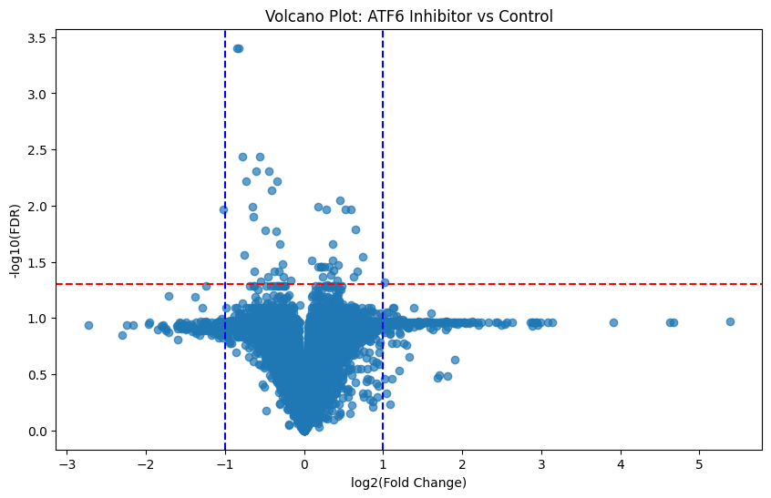
Here is the general schema for interpreting these plots:
↑
more significant
|
|
\ | /
\ | /
\ | /
\ | /
------|----|----|----------> log2(FC)
-1 0 +1
Where:
Points far left or right = large fold changes
Points higher up = low FDR (more statistically significant)
Proteins in the upper left/right corners = most biologically and statistically significant
Knowing this, those points which fall above our statistically significant line of demarkation (FDR < 0.05) and are furthest from 0 (log2_FC > 1 or < 1) are of most interest. And we’ve got more than a handful of them!
Conclusion
Analyzing protein abundance in tissue can help inform very real biological questions like the one our data supported: where the effect of molecular inhibitors revealed regulatory signaling pathways involved in chronic disease.
I mentioned drawing many parallels between protein and scRNA-seq analysis earlier. Here, we’ve compared protein abundance across two conditions to identify proteins whose expression levels significantly change. This is effectively the proteomics analog to RNA-seq differential gene expression.
So now, we know how to work with single-cell RNA data, spatial transcriptomics data and protein abundance data. Look out for next week’s lesson on multi-modal data integration where we put it all together to paint a comprehensive picture of cellular behavior and function!
All supporting code can be found here.
Thanks for the tutorial. It is very informative!
So, proteomics does not seem to be very different from analysing RNASeq data, is that right? The methods seem similar.
Very Vcc familiar.