
The Missing Semester: RNA Transcriptomics
An end-to-end scRNA-seq data analysis workflow.

Welcome to Lesson 1 in Module 1: Data types, of Bioinformatics: The Missing Semester!
Introduction
In this write up, we’ll be covering an end-to-end analysis of scRNA-seq data. This workflow is non-exhaustive, but intended to highlight fundamental methods and logic used by biotech R&D teams to derive biological insights from single-cell RNA transcriptomics data.
One of the most common goals of scRNA-seq analysis is to identify cell populations in a sample. Though simplistic, it becomes powerful when combined with other laboratory methods at the bench. Say I isolate single cells from an embryonic tissue sample at various timepoints. If I classified and annotated cell types present in each sample at every specified timepoint, I can create a map of developmental trajectory over time. For instance, I can objectively say that at t0, mostly neural crest cells were identified. At t1, a larger population of neuroepithelial precursor cells were identified. Coupled with existing literature and functional validation (and for extreme simplicity’s sake), I can hypothesize that from t0 to t1, precursor cell infiltration is occurring; perhaps important for development of a particular organ.
See how simple methods build to inform biological discovery? Now let’s get started.
Exploratory Data Analysis (EDA)
Let’s first import our dependencies:
import scanpy as sc
import matplotlib.pyplot as plt
import leidenalg
import igraph
import numpy as np
For ease of access and reproducibility, we’ll use the quintessential toy dataset of 3,000 PBMCs from scanpy:
adata = sc.datasets.pbmc3k()
adata.raw = adata # always keep the raw data
Now for perhaps the most crucial step in any analysis: EDA.
EDA is often rushed and overlooked; though lackluster, this step ensures the reliability of your downstream results. Admittedly, there is no “one size fits all” for EDA and folks have their own preferences but generally, the goal here is to remove excess noise in the data. Single cell data is characteristically multi-dimensional making the signal:noise ratio unfavorable. Conducting EDA ensures that we’re making it easy for algorithms to recognize patterns in the data and yield trustworthy results.
Since high mitochondrial content often indicates cellular stress, damage, or low-quality RNA, let’s first start by identifying mitochondrial genes and calculating QC metrics:
# annotate MT genes
adata.var["mt"] = adata.var_names.str.startswith("MT-")  # works for human data

# calculate QC metrics
sc.pp.calculate_qc_metrics(
    adata,
    qc_vars=["mt"],
    percent_top=None,
    log1p=False,
    inplace=True
)
Now let’s visualize:
# plot number of genes/cell
sc.pl.violin(adata, ["n_genes_by_counts", "total_counts", "pct_counts_mt"],
             jitter=0.4, multi_panel=True)
These plots can help ascertain:
Low-quality cells with few genes
Cells with too high total counts (possible doublets)
High mitochondrial percentages (possible dying cells)
Where:
n_genes_by_counts= number of total genes detected per celltotal_counts= total UMI counts per cellpct_counts_mt= percentage of total UMI counts from mitochondrial genes per cell
Now based on our interpretation of the plots, let’s set cutoffs to remove unwanted cells and genes we’ve determined to be low-quality:
adata = adata[adata.obs.n_genes_by_counts > 200, :]
adata = adata[adata.obs.n_genes_by_counts < 2000, :]
adata = adata[adata.obs.pct_counts_mt < 5, :]
In the above code, we’re saying that we only care about working with cells that express more than 200 genes but less than 2000, with a percent mitochondrial count of less than 5. Hopefully you begin to see how these cutoffs can be subjective. Go ahead and try adjusting these values based on your own interpretation to see how that affects your clustering downstream.
Unsupervised cell clustering with PCA
Now that we’ve cleaned our data, let’s move on to pre-processing for PCA dimensionality reduction. As we’ve learned, single cell data is characteristically multi-dimensional with a high noise:signal ratio, which makes interpretability poor. Reducing the dimensionality using PCA captures those features (genes) with the most importance (or variance) and projects the data in a 2D space, for easy interpretation.
Since single cell data is inherently sparse, we must first normalize the sequencing depth across cells; otherwise PCA would attribute more importance to cells simply because they had higher counts. Normalizing to 10,000 is common practice in single cell analysis.
Additionally, most values in single cell data are 0, with very few extremely high values; so we’ll then apply a logarithmic transformation (log1p). This compresses large values and spreads out small ones, making the overall distribution more symmetric and suitable for downstream methods like PCA.
Next, we want to maximize biological significance and only focus on genes with high variance within our sample set using scanpy’s highly_variable_genes. PCA is sensitive to noise, so the goal is always to reduce the signal:noise ratio to make it easier for our algorithms to discern patterns within the data.
Finally, since PCA is a variance-based method—if certain genes have large numeric ranges, they dominate the principal components. Scaling ensures each gene contributes equally, so patterns reflect co-expression, not magnitude:
# normalize total counts to 10,000
sc.pp.normalize_total(adata, target_sum=1e4)

# log transform
sc.pp.log1p(adata)

# identify highly-variable genes
sc.pp.highly_variable_genes(adata, min_mean=0.0125, max_mean=3, min_disp=0.5)
adata = adata[:, adata.var.highly_variable]

# scale each gene to unit variance and zero mean, clip extreme values to ±10
sc.pp.scale(adata, max_value=10)
Now that we’ve reduced noise and boosted the signal to the best of our ability, we can apply PCA to yield the top informative axes (often the top 30–50 PCs) capturing major patterns of variation (e.g., cell types or states):
# perform PCA
sc.tl.pca(adata, svd_solver='arpack')
For visualization purposes, we’ll take advantage of a K-nearest-neighbor graph of cells based on their PCA embeddings. We first need to set the appropriate number of neighbors i.e the size of the “local neighborhood” for manifold approximation. Larger values result in more global views of the manifold, while smaller values result in more local data being preserved; so this value directly impacts the overall resolution of your clustering:
# set nearest neighbors and compute UMAP
sc.pp.neighbors(adata, n_neighbors=10, n_pcs=40)
sc.tl.umap(adata)
This is another area that is largely influenced by existing literature and individual preference. Play around with n_neighbors to see how your plot is impacted.
Ultimately, UMAP turns the neighbor graph into an intuitive low-dimensional projection:
# perform leiden clustering
sc.tl.leiden(adata, resolution=0.5)
sc.pl.umap(adata, color=['leiden'], title='Leiden Clustering')
As an added step, we can evaluate how marker genes define the clusters. Importantly, UMAP clustering groups cells according to similarity, but it doesn’t define cell populations for us. To say “this is a T cell cluster” or “this is a monocyte cluster,” we need to identify which genes are being most highly expressed in each group:
sc.tl.rank_genes_groups(adata, 'leiden', method='t-test')
sc.pl.rank_genes_groups(adata, n_genes=20, sharey=False)
The above steps are performing differential expression analysis to find marker genes that distinguish each cluster defined by the 'leiden' column in adata.obs.
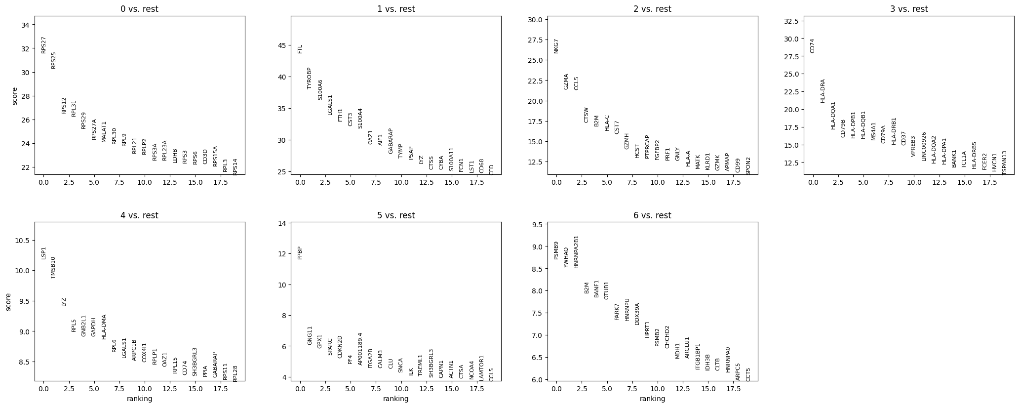
Now according to our marker gene analysis, coupled with a review of existing literature and functional analysis (if accessible) we can manually annotate our cell clusters with their respective cell populations.
# manually annotate clusters (using canonical markers)
cluster_annotations = {
    '0': 'CD4 T cells',
    '1': 'CD14+ Monocytes',
    '2': 'B cells',
    '3': 'CD8 T cells',
    '4': 'NK cells',
    '5': 'FCGR3A+ Monocytes',
    '6': 'Dendritic cells',
    '7': 'Megakaryocytes',
}

adata.obs['cell_type'] = adata.obs['leiden'].map(cluster_annotations)
sc.pl.umap(adata, color=['cell_type'], title='Annotated Cell Types')
So now we have:

Conclusion
Typically, an end-to-end analysis of scRNA-seq data like this one can inform further functional validation at the bench or prompt additional integrated analysis to get a holistic picture of cellular behavior and function.
With that said, in Lesson 2 we’ll be covering an analysis of spatial transcriptomics data as an additional modality for guiding biological interpretation.
The data, code and environment .txt file associated with this workflow can be found here.
Dear Aneesa,
Thanks for sharing this great beginner resource! Do you have examples of messier, more complex data to practice on? I’d love to learn how you decide on QC cutoffs like n_genes_by_counts or pct_counts_mt, and how you tell if an experiment’s data is too noisy or flawed. Coming from the wet lab, I’m curious how real-world variability shows up in the data and how you spot potential wet-lab issues from sequencing results.
Thank you in advance!
This is great! I learned so much here, am definitely looking forward to following along more!