


The Missing Semester: Spatial Transcriptomics
An overview of spatial transcriptomics cell-type and L-R pair mapping.

Welcome to Lesson 2 in Module 1: Data types, of Bioinformatics: The Missing Semester!
Introduction
In this write-up, we’ll be covering an analysis of spatial transcriptomics data. It is worth mentioning that this workflow is non-exhaustive. The intent is to demonstrate fundamental methods and concepts central to spatial analysis done by scientists and engineers in commercial R&D.
Spatial transcriptomics is a rapidly growing area in biotech and pharma R&D, and it’s being used for everything from tissue microenvironment profiling to drug target localization.
In this walkthrough, we’ll use a toy Visium dataset from 10X Genomics to both map gene location in a tissue sample and infer ligand-receptor (L-R) interactions.
Exploratory Data Analysis
As always, before we get into the shiny downstream analysis, we need to ensure our data is “clean”. Practically speaking, this can include getting rid of low-quality cells and appropriately formatting the data (log normalization, scaling etc.).
Importantly, Visium data captures transcriptomic information with associated spatial coordinates. Unlike single-cell RNA-seq, each measurement reflects gene expression aggregated across small tissue regions (spots), each with a defined spatial location. Therefore, gene expression is mapped to specific spots in the tissue, enabling spatially-resolved transcriptomics at near single-cell resolution.
Regardless of this nuance, since Visium captures single-cell transcriptomic information, our pre-processing will look analogous to that which we completed in last week’s lesson on scRNA transcriptomics analysis. Please review the previous lesson for the how’s and why’s for each of these pre-processing steps if you need a refresher.
We begin by loading our dependencies and importing the data using scanpy:
import scanpy as sc
import squidpy as sq
import matplotlib.pyplot as plt
import numpy as np
import pandas as pd


# load spatial data
adata = sc.datasets.visium_sge()
adata.var_names_make_unique() # optional but good practice
Running adata in a separate cell tells us we’re working with the following:
AnnData object with n_obs × n_vars = 3798 × 36601
    obs: 'in_tissue', 'array_row', 'array_col'
    var: 'gene_ids', 'feature_types', 'genome'
    uns: 'spatial'
    obsm: 'spatial'
Onto general pre-processing (being generous with min_cells here for simplicity):
sc.pp.filter_genes(adata, min_cells=3)
sc.pp.normalize_total(adata, target_sum=1e4)
sc.pp.log1p(adata)
sc.pp.highly_variable_genes(adata, flavor="seurat", n_top_genes=2000)
adata = adata[:, adata.var.highly_variable]
Now to reduce the dimensionality of the data with PCA and cluster our cells into distinct populations:
# redcuce dims
sc.pp.scale(adata)
sc.tl.pca(adata, svd_solver='arpack')
sc.pp.neighbors(adata, n_neighbors=10)
sc.tl.umap(adata)
sc.tl.leiden(adata)
Spatial data overlay
This is where our workflow begins to differ from a traditional scRNA-seq analysis. We’re going to visualize the leiden clustering above (transcriptomic information), overlayed onto the histopathology image using the spatial coordinates stored in (adata.obsm['spatial']):
sc.pl.spatial(adata, color='leiden', spot_size=100)And we get:
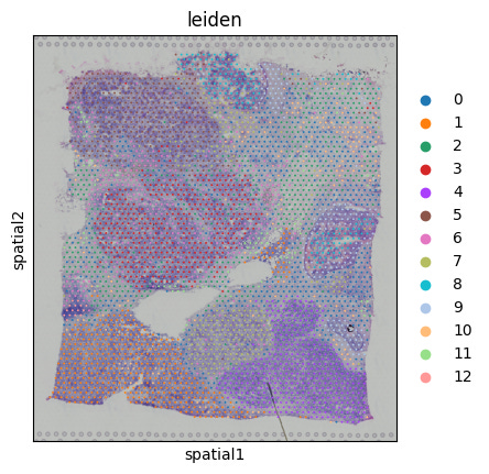
We’ve now visualized expression-driven clustering, spatially. If we were to annotate the clusters, we could determine where particular cell populations reside, which could be important for evaluating drug treatment responses or target validation. One way to help us annotate clusters would be to identify marker genes:
# identify marker genes
sc.tl.rank_genes_groups(adata, 'leiden', method='t-test')
sc.pl.rank_genes_groups(adata, n_genes=5, sharey=False)
Which yields:
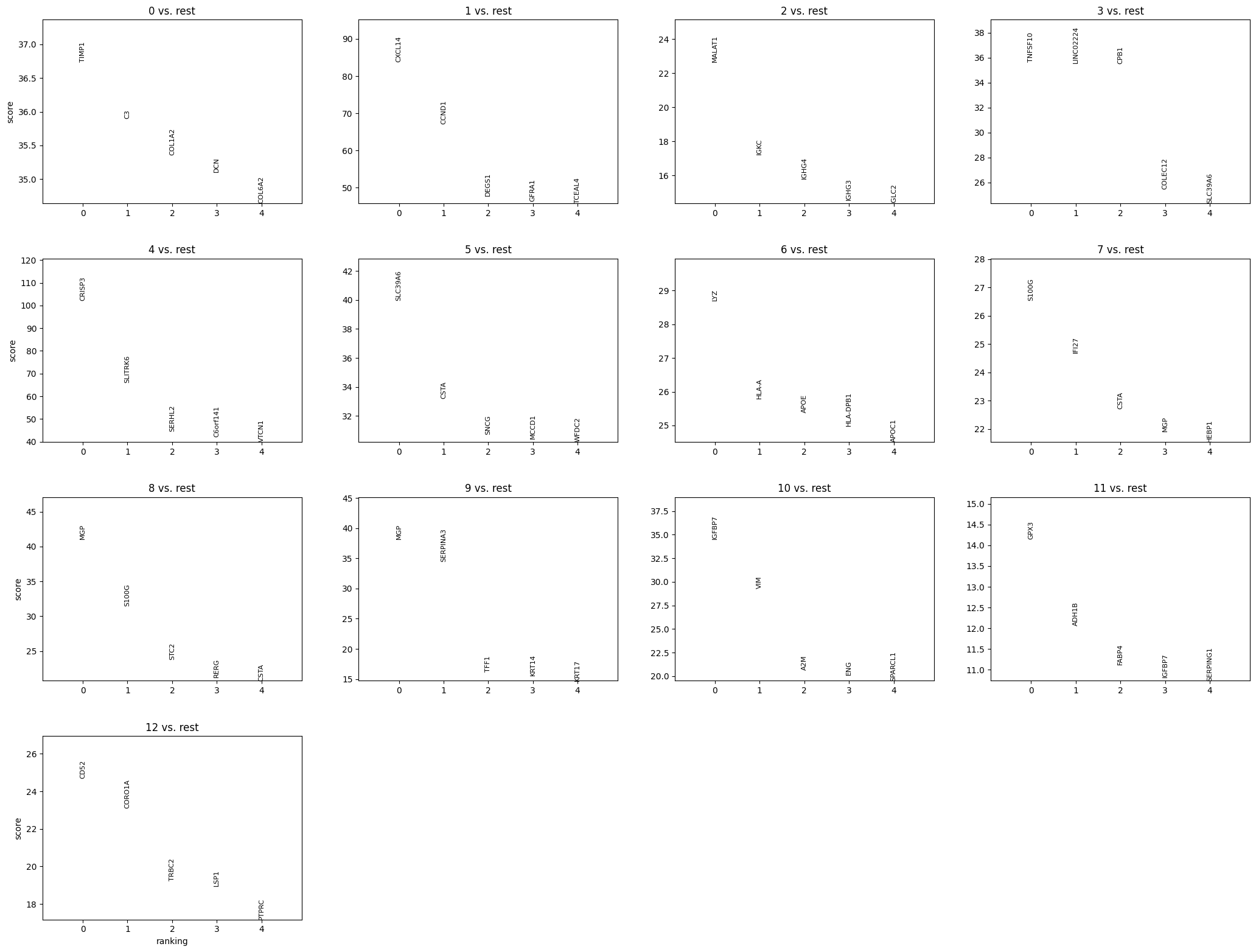
Where each plot shows:
The top 5 marker genes for one cluster vs. the rest (e.g., “0 vs. rest” means genes enriched in cluster 0).
The ranking on the x-axis (0 = most enriched).
A score (typically based on a statistic like log fold-change or t-test) on the y-axis.
Spatial gene autocorrelation
Now let’s dive a bit deeper and uncover more nuanced spatial relationships in gene expression.
What’s next will be an exercise in statistics and probability; we’ve already got a sense of spatial orientation of gene expression, now let’s determine biological relevance.
Since certain genes are only active in certain regions, we want to identify not only genes with variable expression overall, but those whose expression patterns reflect tissue architecture or distinct biological zones.
First, let’s compute spatial neighbor relationships across cells (important for any spatial method).
# spatial neighborhood enrichment
sq.gr.spatial_neighbors(adata)
Then assesses whether gene expression levels are spatially patterned using Moran’s I:
sq.gr.spatial_autocorr(adata, mode='moran')This produces a Moran’s I value, with associated significance values. Paired together, these statistics can help us identify genes that may be structurally meaningful.
Let’s plot the genes associated with the top 20 Moran’s I values:
# convert result to df
moran_df = pd.DataFrame(adata.uns['moranI'])

# set gene names as col (instead of index)
moran_df = moran_df.reset_index().rename(columns={"index": "gene"})

# sort by Moran's I value
moran_df_sorted = moran_df.sort_values("I", ascending=False)

# plot top 20 genes
top_n = 20
plt.figure(figsize=(10, 6))
plt.barh(
    moran_df_sorted['gene'][:top_n][::-1],   # reverse for descending y-axis
    moran_df_sorted['I'][:top_n][::-1]
)
plt.xlabel("Moran's I")
plt.title(f"Top {top_n} Genes by Spatial Autocorrelation")
plt.tight_layout()
plt.show()
Which yields:
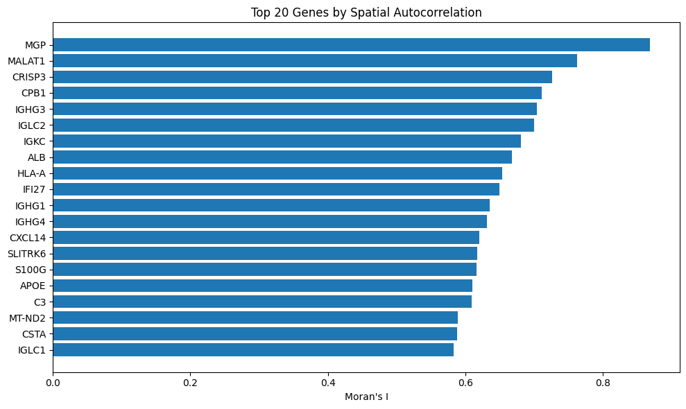
Since MGP is number 1, we can assume that it is spatially structured and not variable by random chance. You’ll recall that we also identified MGP as the most enriched marker gene in cluster 8, above.
Overall, spatial autocorrelation can be helpful for guiding downstream analysis like linking gene function to tissue structure or prioritizing gene candidates for molecular profiling.
Ligand-receptor interaction mapping
To take our spatial autocorrelation analysis further, let’s perform a ligand-receptor pair analysis. This is a slightly advanced method, and relies on known L-R pairs to infer cell-cell communication patterns based on their expression in particular cell clusters. Sounds simple, but this method harbors insane predictive power and can be a years’-long research project in its own right
First, let’s look for instances in the data where a ligand is expressed in one cluster and its receptor in another:
sq.gr.ligrec(adata, n_perms=100, cluster_key='leiden', use_raw=False)Note: Setting n_perms = 100 uses 100 permutations to allow us to ask: Is this interaction stronger than random chance?
Now to plot the result above:
sq.pl.ligrec(adata, cluster_key='leiden', means_range=(0.5, 1), figsize=(8, 8))And get:
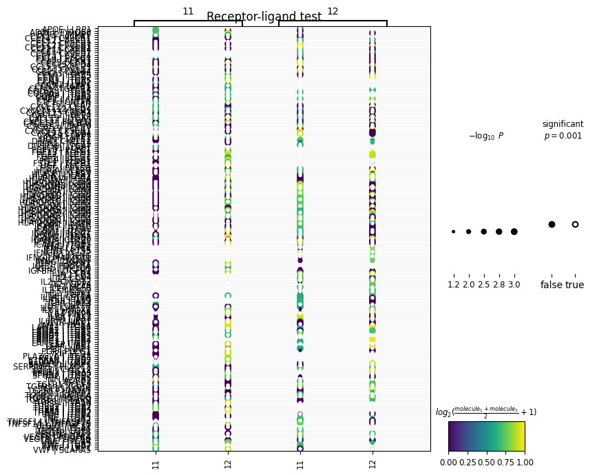
This is a bit messy so for visualization purposes, let’s adjust the size of our plot and tell squidpy that we’re only interested in viewing L-R interactions between two cell clusters of interest:
# plot only specific clusters
sq.pl.ligrec(
    adata,
    cluster_key='leiden',
    source_groups=['11'],
    target_groups=['12'],
    figsize=(8, 18),
    means_range=(0.5, 1)
)
In the above code, we’re plotting ligands expressed in cluster 11 with receptors expressed in cluster 12. Now we get:
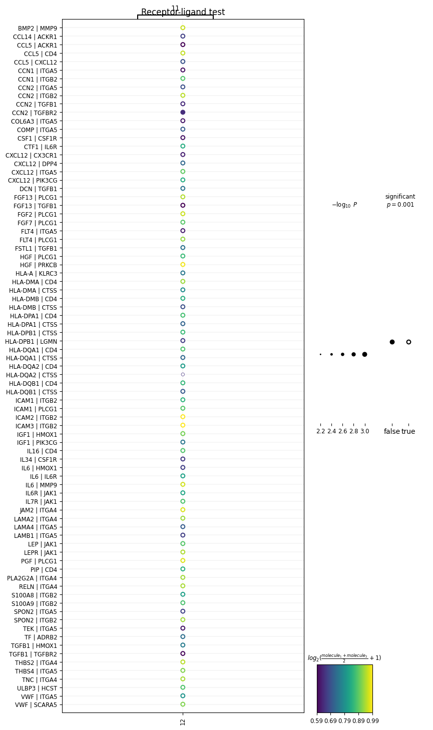
We’ve generated a dot-plot where:
Rows = a L-R pair written as L|R
Columns = a sender or receiver cluster
Color intensity = strength of the L-R interaction (mean expression of ligand and receptor across interacting clusters)
Note: The cluster numbers on the top and bottom of the x-axis represent the direction of the interaction (i.e., cluster 11 → cluster 12).
Conclusion
Molecular profiles only comprise one piece of biological complexity. Tissues aren’t uniform; they’re made of localized zones like tumor micro-environments or immune niches. Finding spatially informative genes harbors value across bioscience R&D, particularly in fields like oncology, immunology, neuroscience and regenerative medicine for mapping gene expression to tissue architecture.
Till now, we’ve been focused on gene expression as a contributor to cellular structure and function. Look out for next week’s lesson when we tackle a completely new modality: proteomics!
All data, code and environment files can be found here.